Unique Floral Watercolor Prints for Walls: 2026 Guide
Table of Contents
Last Updated: October 5, 2026
Why Unique Floral Watercolor Prints for Walls Stand Out
Walk through any homeware chain and you will see the same three floral prints repeated on every shelf. Mass production has made wall art cheap, but it has also made it forgettable. Unique floral watercolor prints for walls solve that problem: soft pigment, visible brushwork, and a design you will not find in a neighbour's hallway. At Art By Jd, every piece begins as a painting by artist Joylyn Denna before it becomes a print, a canvas, or a card.
The difference is not just aesthetic. Watercolour behaves differently from acrylic or digital art. The pigment settles into the paper, edges bloom, and colours layer translucently. That is why a floral watercolor print reads as calm rather than loud, and why it suits almost any interior.
Below, we break down the styles, materials, sizes, and room-by-room placements that matter, so you can choose a print you will still love in five years.
Key Takeaway Watercolour's translucent layering is what separates a handmade floral print from a flat digital file. Look for visible pigment variation, soft edges, and paper texture.
Watercolor Flower Art Prints: Styles, Materials, and What Lasts
Watercolor flower art prints fall into a handful of recognisable styles, and knowing them makes choosing far easier:
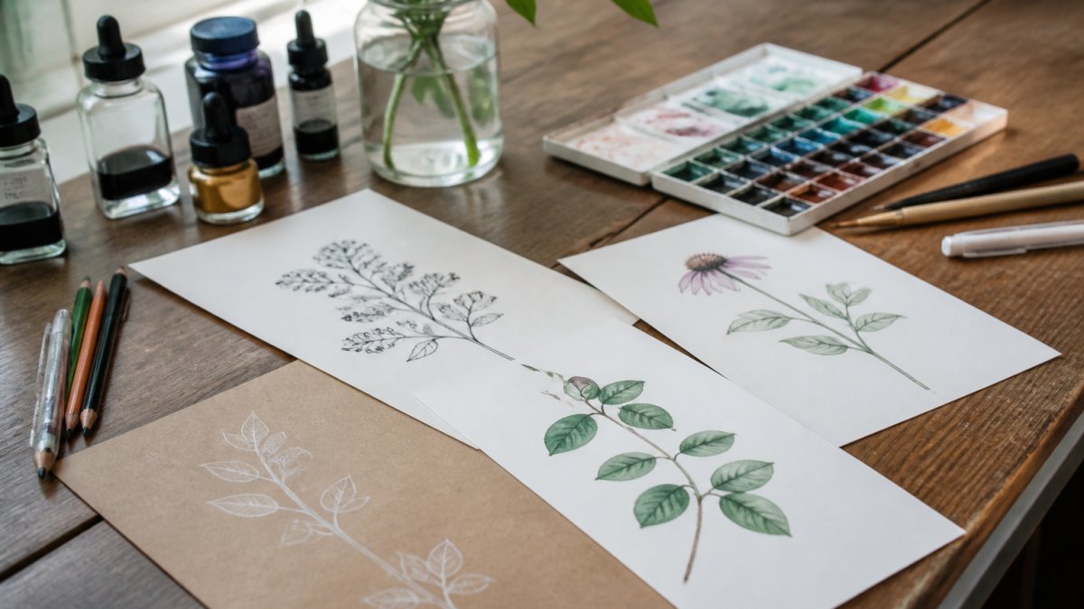
Botanical illustrations - precise, scientific studies of a single species, often with visible labelling or Latin names
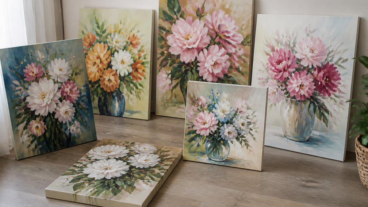
Loose watercolor florals - expressive washes with visible brushstrokes and soft, bleeding edges
Wildflower designs - mixed meadow stems in soft, natural colours, usually arranged as a loose bunch
Tropical flowers and leaves - monstera, palm, hibiscus, and bird of paradise in bolder, saturated tones
Minimal botanical artwork - one stem or leaf on a large white field, relying on negative space
Abstract botanicals - floral shapes suggested through colour fields and gesture rather than literal depiction
The Victoria and Albert Museum's collection of botanical illustration shows how far back this tradition runs, and why it still feels current. Less-represented options worth seeking out include unusual flower varieties (hellebores, ranunculus, sweet peas), seasonal palettes (autumn rusts, spring pastels), and varied compositions such as circular wreaths or asymmetric single-stem studies.
Paper, Canvas, and Print Durability
The material a print is produced on affects how it looks, how long it lasts, and where it can hang. Most sellers offer two main formats, and the differences matter more than the price tag suggests.
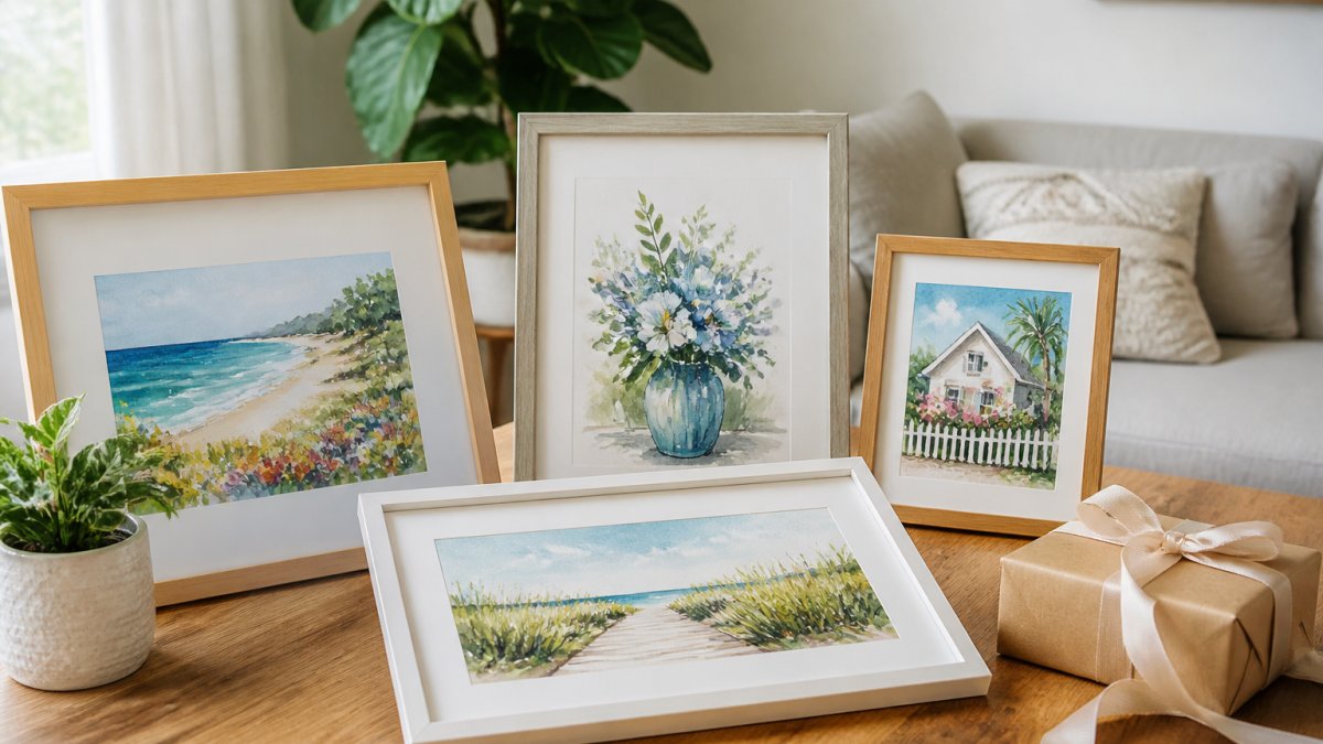
Fine art paper prints are typically produced on cotton rag or alpha-cellulose paper with a matte or textured finish. Paper prints need framing under glass to protect them from dust, moisture, and UV light.
Stretched canvas prints arrive ready to hang with no frame or glass needed. Canvas handles humid rooms better than paper because there is no glazing to trap condensation, and it survives rehanging without glass breakage or frame warping.
Archival inks and colorfastness. Most quality reproductions use pigment-based inks rather than dye-based inks. Pigment inks resist fading far better and are usually described as archival or lightfast.
Care basics. Keep prints out of direct sunlight, avoid hanging paper prints in bathrooms or above radiators where humidity swings, and dust canvas with a dry, soft brush rather than a damp cloth.
Pro Tip If you plan to move frequently, choose stretched canvas over framed paper. It survives rehanging without glass breakage or frame damage.
Botanical Watercolor Wall Art: From Neutral Palettes to Tropical Statements
Botanical watercolor wall art covers an enormous range, from barely-there neutrals to saturated tropical pieces. The palette you choose does more for a room than the flower species does.
Neutral and earthy palettes - sage, ochre, clay, and warm grey; they blend into calm, minimal rooms
Soft pinks and greens - classic pink flower prints with green stems; they warm up bedrooms and nurseries
Tropical and colourful - vivid leaves and blooms; they carry a hallway or dining room on their own
Matching the Palette to Your Room
Pull one colour from the print and repeat it elsewhere in the room. A blush-toned floral pairs with a cushion or a throw in the same blush. A sage-green botanical pairs with a plant pot or a ceramic vase. This is the simplest way to make art look intentional rather than added on.
Watch Out Buying art before you know your wall colour is the most common mistake we see. A warm ochre print on a cool grey wall will fight the room. Photograph your wall in daylight, then compare it against the print's palette before ordering.
Original Watercolor Flower Paintings vs. Reproductions
Original watercolor flower paintings are one-of-a-kind pieces; reproductions are high-quality copies of an original. Both belong on a wall, and the right choice depends on budget and intent.
Buy an original when you want a piece no one else owns, when you are marking a milestone, or when you are building a small collection. Buy a reproduction when you love a specific design, want to hang several pieces as a set, or need a gift at a friendlier price point.
One fair question buyers ask: how do you know a piece is genuinely hand-painted rather than generated digitally? At Art By Jd, the originals by Joylyn Denna are the source, and the prints are made from those paintings.
Factor | Original Painting | Reproduction Print |
Uniqueness | One of a kind | Produced in editions |
Best for | Collectors, milestone gifts | Sets, gifts, first art purchase |
Care needs | Handle paper directly, frame under glass | Canvas needs no glass |
|
|
|
Sizes, Framing, and Hanging Your Floral Watercolor Prints
Size and placement decide whether a print looks considered or accidental. A useful rule: art should span roughly two-thirds to three-quarters of the width of the furniture below it.
Above a sofa - a single large piece or a set of two to three smaller prints
Above a bed - one wide piece centred on the headboard, hung so the bottom edge sits well above the pillows
In a hallway - a vertical stack of two or three prints at eye level
In a small room - one medium print beats a crowded gallery wall
For hanging height, place the centre of the artwork at roughly eye level, which for most people sits around 145 to 150 centimetres from the floor.
Best For Renters and frequent movers: stretched canvas prints in neutral or earthy palettes, hung with removable adhesive hooks on lighter pieces.
Room-by-Room Placement for Floral Watercolor Prints
Room-by-room placement is where floral watercolor prints earn their keep, because the same print can feel restful in a bedroom and flat in a hallway. Match the energy of the piece to the job of the room, and size it to the furniture beneath it.
A useful starting rule: art should span roughly two-thirds to three-quarters of the width of the furniture below it. For a standard 200 cm sofa, that means a single piece around 140-150 cm wide, or a set of two to three smaller prints whose combined width hits that range. For a queen bed (about 150 cm wide), a single piece around 100-115 cm wide centred on the headboard reads as intentional rather than undersized.
Living room. A large botanical or loose floral above the sofa, in a palette pulled from your cushions or rug. Hang the bottom edge 20-30 cm above the sofa back so the art feels connected to the furniture rather than floating. If you use a set, keep the gap between frames to 5-8 cm so the group reads as one unit.
Bedroom. Soft pink flowers and green stems in muted tones, kept low-contrast for rest. Centre one wide piece on the headboard, with the bottom edge sitting well above the pillows, usually 20-25 cm above the mattress top. Avoid high-saturation tropical pieces here; they raise the visual energy of the room.
Kitchen or dining room. Tropical flowers and leaves or a wildflower set, where bolder colour works. A horizontal pair or a row of three small prints above a sideboard or banquette adds colour without competing with cabinetry. Keep art away from the immediate splash zone of the hob and sink.
Bathroom. A single minimal botanical in a sealed frame or on canvas, positioned away from direct shower spray. Canvas is the safer choice here because there is no glazing to fog or trap moisture. If you use paper, choose UV-filtering glass and a sealed backing.
Entryway. A vertical stack of two or three prints at eye level, or one tall narrow botanical beside a console. This is a good spot for a bolder tropical or wildflower piece, since the entryway is a transition space rather than a rest space.
Home office. A grid of two or three small prints behind the desk to break up a blank wall, or a single medium piece at eye level to the side of the monitor. Neutral and earthy palettes reduce visual fatigue during long work sessions.
Small rooms. One medium print beats a crowded gallery wall. If you want more than one piece, keep the palette and frame identical and vary only the flower, this is the single most reliable way to make a set look curated rather than chaotic.
For hanging height, place the centre of the artwork at roughly eye level, which for most people sits around 145-150 cm from the floor. For gallery walls, lay the arrangement on the floor first and photograph it before committing to nails.
If you are buying as a gift and are unsure of the recipient's taste, a neutral botanical in a mid-size format is the safest choice. A soft, earthy palette fits almost any interior, and it will not clash with furniture you have never seen.

Frequently Asked Questions
How do you choose floral watercolor prints for a room?
Start with the room's existing palette. Pull one or two colors from your furniture or textiles and look for watercolor flower art prints that repeat them. For neutral rooms, soft pinks, sage greens, and earthy tones work well. For bolder spaces, tropical flowers and brighter blooms add energy. Measure your wall space before ordering so the print fills roughly two-thirds of the available width above a sofa or console.
What makes a floral watercolor print feel unique?
Hand-painted originals and limited reproductions carry small variations in color blending and brushwork that mass-produced posters do not. Look for visible brush strokes, paper texture, and a signature or edition number. Prints made from original watercolor flower paintings rather than digital files tend to show softer gradients and irregular edges that give each piece its own character.
How should you arrange botanical prints on a wall?
Group prints in odd numbers, usually three or five, and keep the spacing between frames consistent at 5 to 8 centimetres. Align the centre of the arrangement at eye level, roughly 145 to 150 centimetres from the floor. For a gallery wall, mix sizes but repeat one element, such as frame colour or a shared color palette, so the group reads as a set rather than a random collection.
Will watercolor prints hold up if I rent and move often?
Prints on textured paper are more fragile than stretched canvas, so handle them by the frame, not the surface. Stretched canvas reproductions are the more durable option for frequent movers since there is no glass to crack.
Get Started Today
Comments